After thinking it over, I would rather
not involve butterflies. Do you think it could be possible to find today
in New York an artist who would not be influenced in his work by the
general cartoonesque and primitivist style jacket illustration? Who
would be capable of creating a romantic, delicately drawn, non-Freudian
and non-juvenile, picture for LOLITA (a dissolving remoteness, a soft
American landscape, a nostalgic highway—that sort of thing)? There is
one subject which I am emphatically opposed to: any kind of
representation of a little girl.
Minton sent Nabokov some sent him some drafts. Nabokov rejected them all.“I have just received the five designs and I quite agree with you that none of them is satisfactory,” he wrote. “I want pure colors, melting clouds, accurately drawn details, a sunburst above a receding road with the light reflected in furrows and ruts, after rain. And no girls. If we cannot find that kind of artistic and virile painting, let us settle for an immaculate white jacket (rough texture paper instead of the usual glossy kind), with LOLITA in bold black lettering.”
In the end, he sort of got that—with green instead of white, and he was satisfied well enough. As many have pointed out, Lolita is an exceptionally difficult book to design for. In the 60 years since its American publication (and 63 since its original appearance), many of tried, and almost all of them have failed. Certainly most of the below covers run contrary to Nabokov’s original wishes.
Below, you’ll find 60 cover treatments of Lolita from all over the world, organized into wide, baggy categories of “best” and “worst.” For my own personal taste I can make no excuses. All of these were actually published (there have been lots of casual redesigns and fan art over the years, but those are for another day). I found many of the covers using Nabokov scholar and translator Dieter E. Zimmer’s Covering Lolita, but others came from the deep reaches of the Internet. I’ve tried to be as accurate as possible with dates and publishing houses, but as I’m sure you know, the Internet can never be fully trusted on these things.
THE BEST:
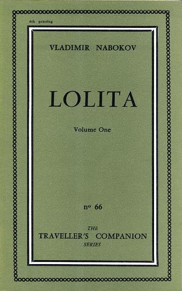
Published by Olympia Press, Paris, 1955
I know that the first French edition of Lolita is famously boring and even famously ugly, but I’ve always sort of liked it. The color is a pleasing olive green and the cover as a whole looks erudite and understated—the latter of which contrasts nicely with the contents.
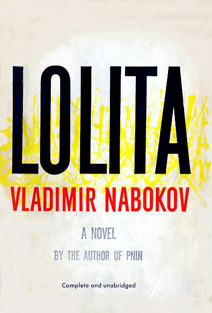
Published by Putnam, New York, 1958
The original US edition isn’t anything special, especially by today’s standards. But it does the job, and it’s not hysterical or over-sexualized, and I don’t hate it. It announces the book as the high-class literary marvel that it is. ... [mehr] https://lithub.com/the-60-best-and-worst-international-covers-of-lolita/
Keine Kommentare:
Kommentar veröffentlichen